Introducing Brands for Nord Design System
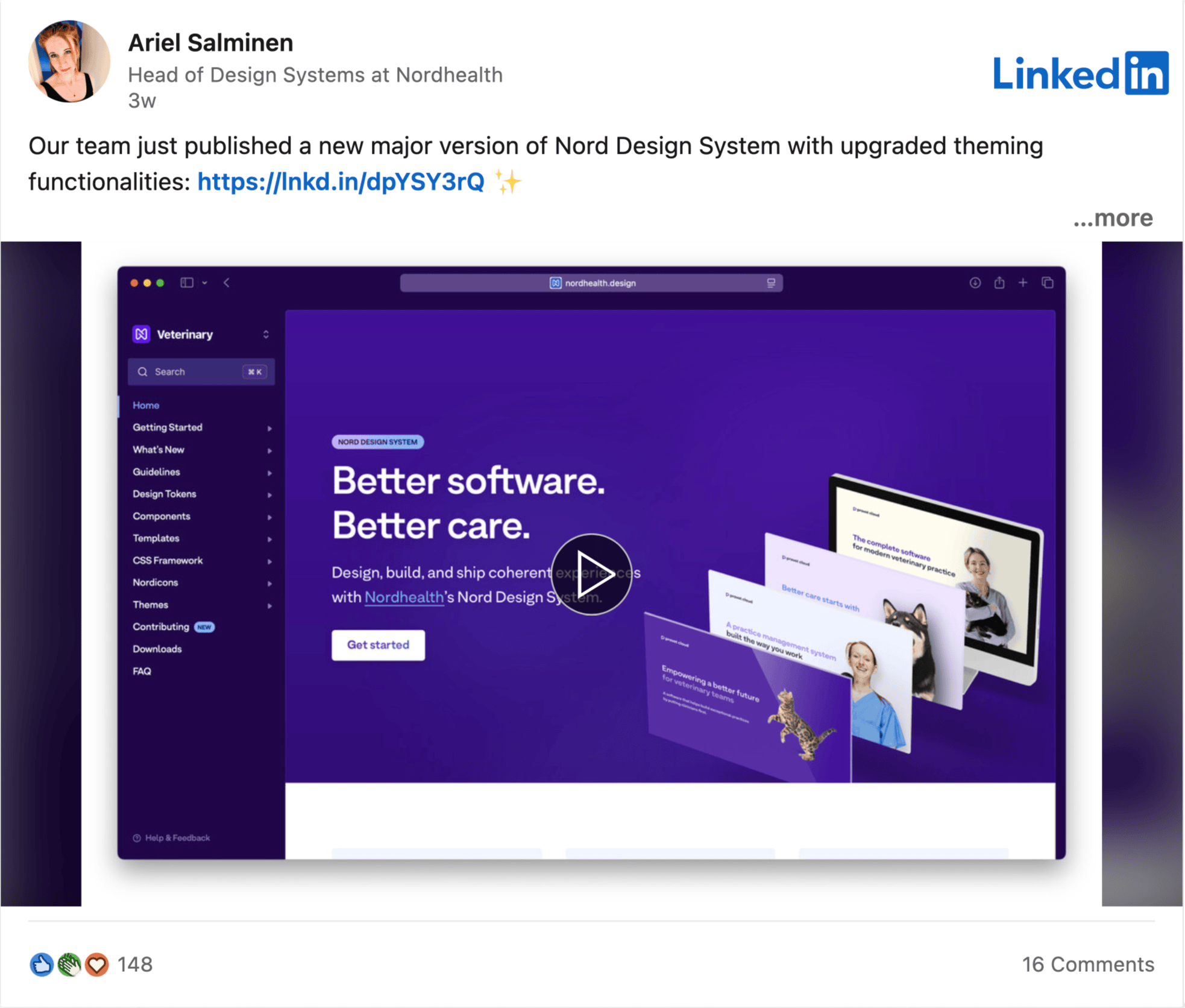
Over the past six weeks, my colleague and I have been working on a new major update for the Nord Design System. The latest 4.0 version launched a few weeks ago now unifies Nordhealth’s two design system platforms into a single platform that can serve all of the feature teams across the entire organization and various business units within.
We identified this consolidation as a necessary step to strengthen the organization’s design system infrastructure and better support the next generation of applications and generative AI experiences that the feature teams are working on.
To learn more about the new features included in the latest release, keep reading below for details. ✨
Overview of Changes
The latest version of Nord Design System now ships with two distinctive brands, therapy and veterinary. You can choose the currently active brand from the top left corner of the updated documentation platform. Once chosen, you will get content that is tailored specifically for the brand and the business unit you’re working in:
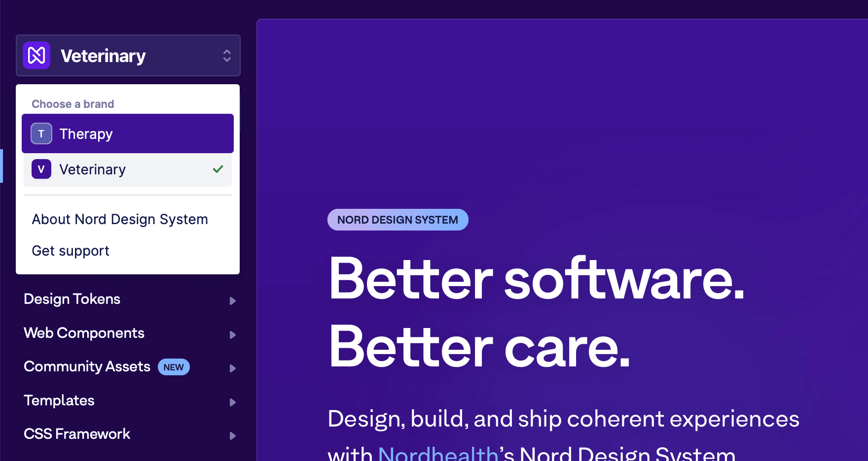 Brand switcher in the latest version of Nord Design System.
While this is a major change for the underlying architecture of Nord Design System, we’ve kept it as backwards compatible as possible so that the upgrade path would stay straightforward. Hence, this major release doesn’t include any breaking changes for the existing users.
Introducing this new layer of abstraction into Nord’s theming architecture means that it now consists of the following four layers:
- Foundations: The foundations for building the next generation of apps and generative AI experiences at Nordhealth.
- Brands: Any business unit specific customizations.
- Interface Modes: Light, dark, and high contrast themes.
- Accent Color: For apps that provide custom theming.
- Interface Modes: Light, dark, and high contrast themes.
- Brands: Any business unit specific customizations.
Improved Documentation
While creating the technical foundations to support this newly introduced theming architecture, I have been on the side also improving the design and usability of the documentation platform ever so slightly. The latest iteration looks like this:
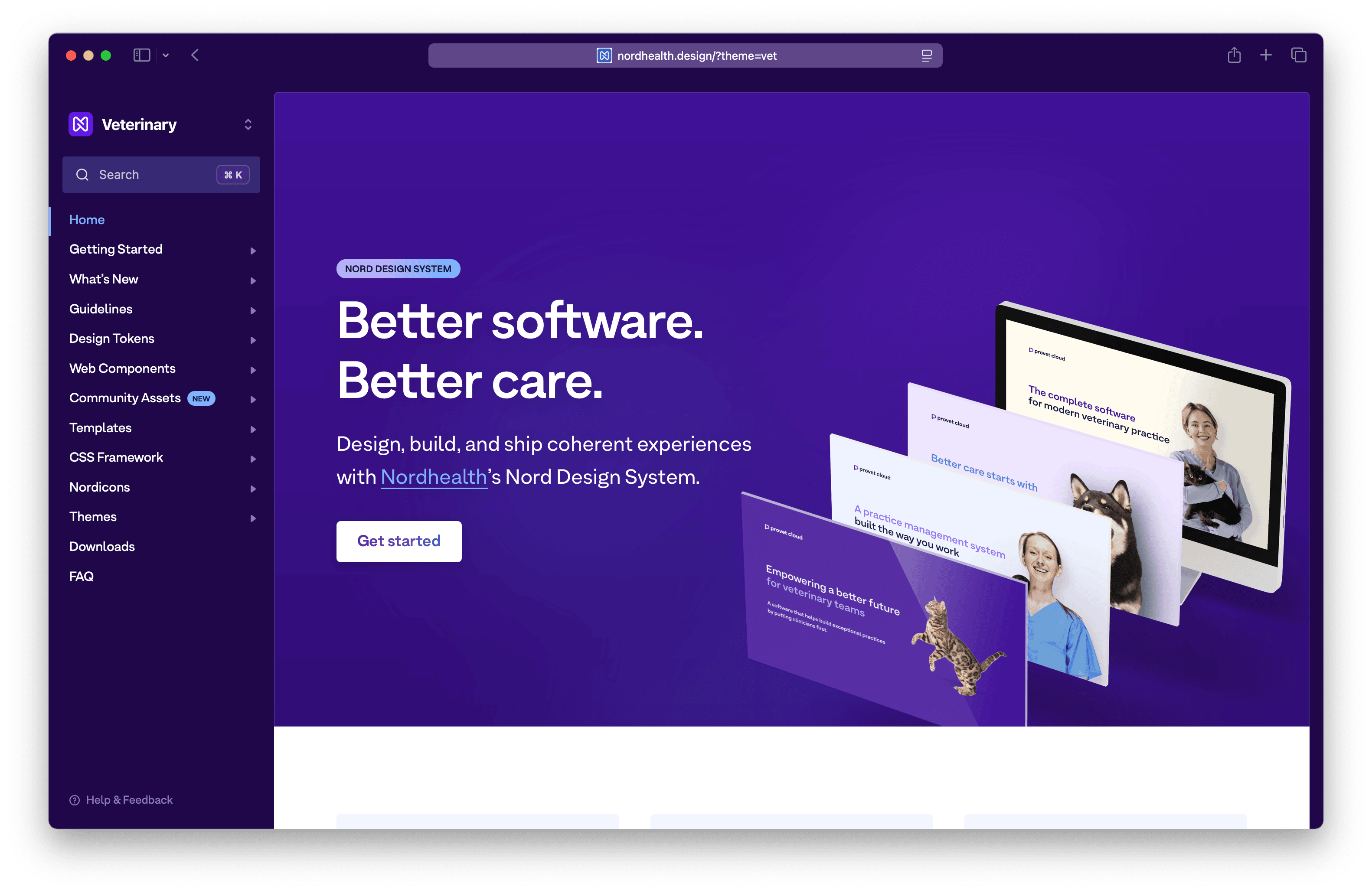 Version 4.0 of Nord Design System.
All pages within the documentation platform are updated as well. The design tokens for example now ship with a total of 8 different interface theme modes which you can view by switching the brands:
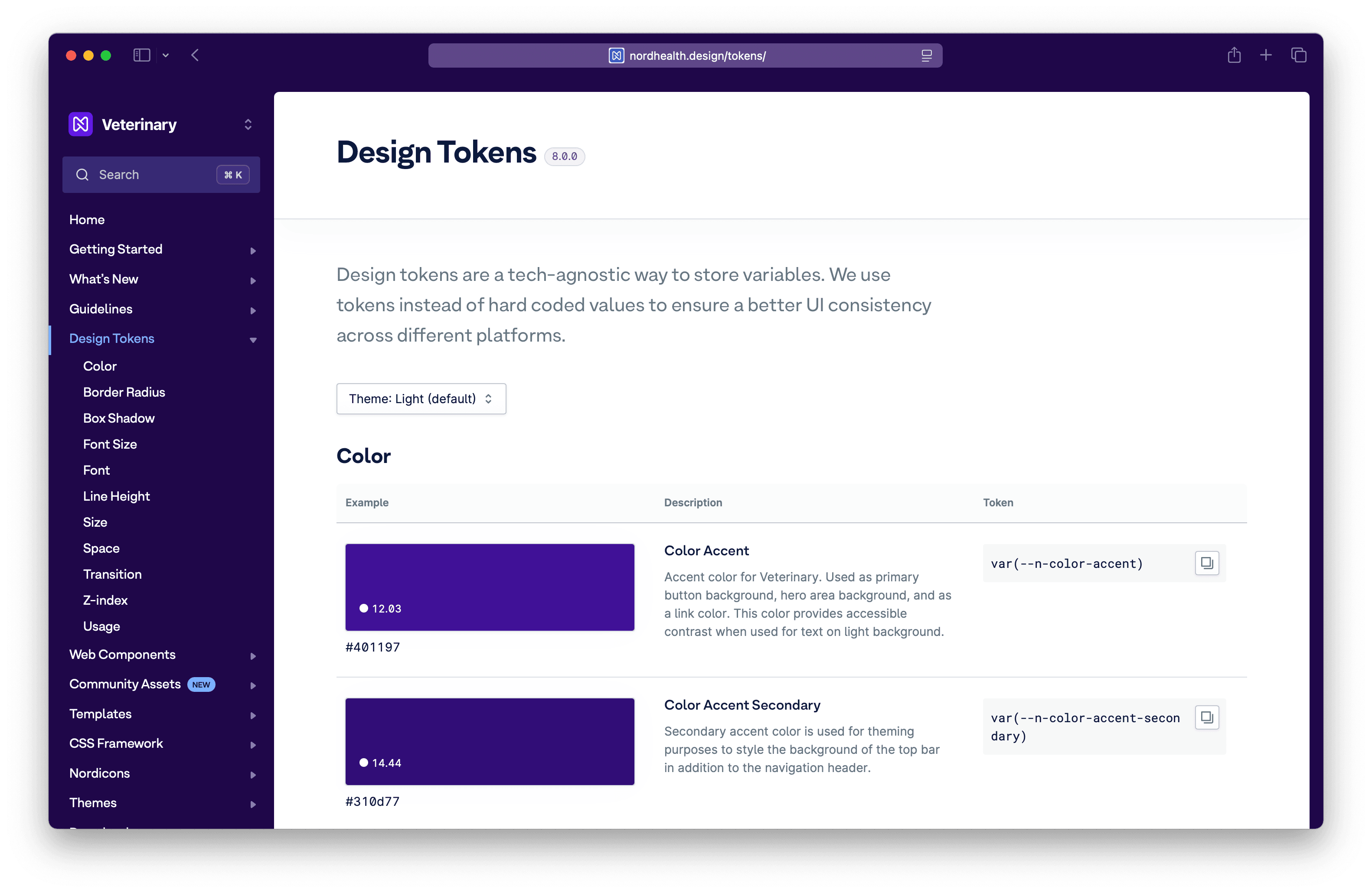 Design Tokens in version 4.0 of Nord Design System.
We have also upgraded all of the existing web components to support the new theming architecture so that they can be used as building blocks for any brand specific applications within Nordhealth:
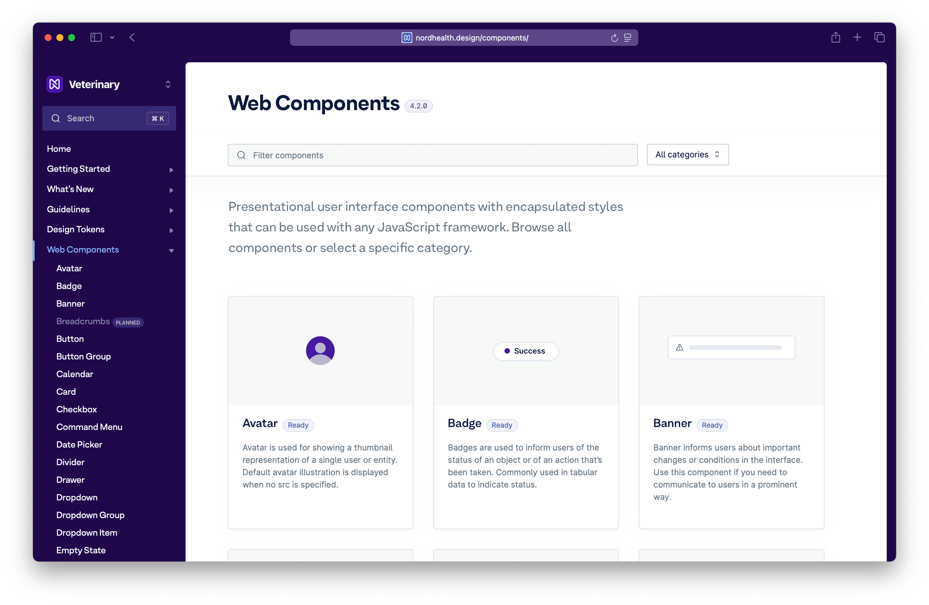 Web Components in version 4.0 of Nord Design System.
I also wrote an in-depth migration guide that will help developers to transition an existing project from using an older version of Nord Design System to using the latest 4.0 version:
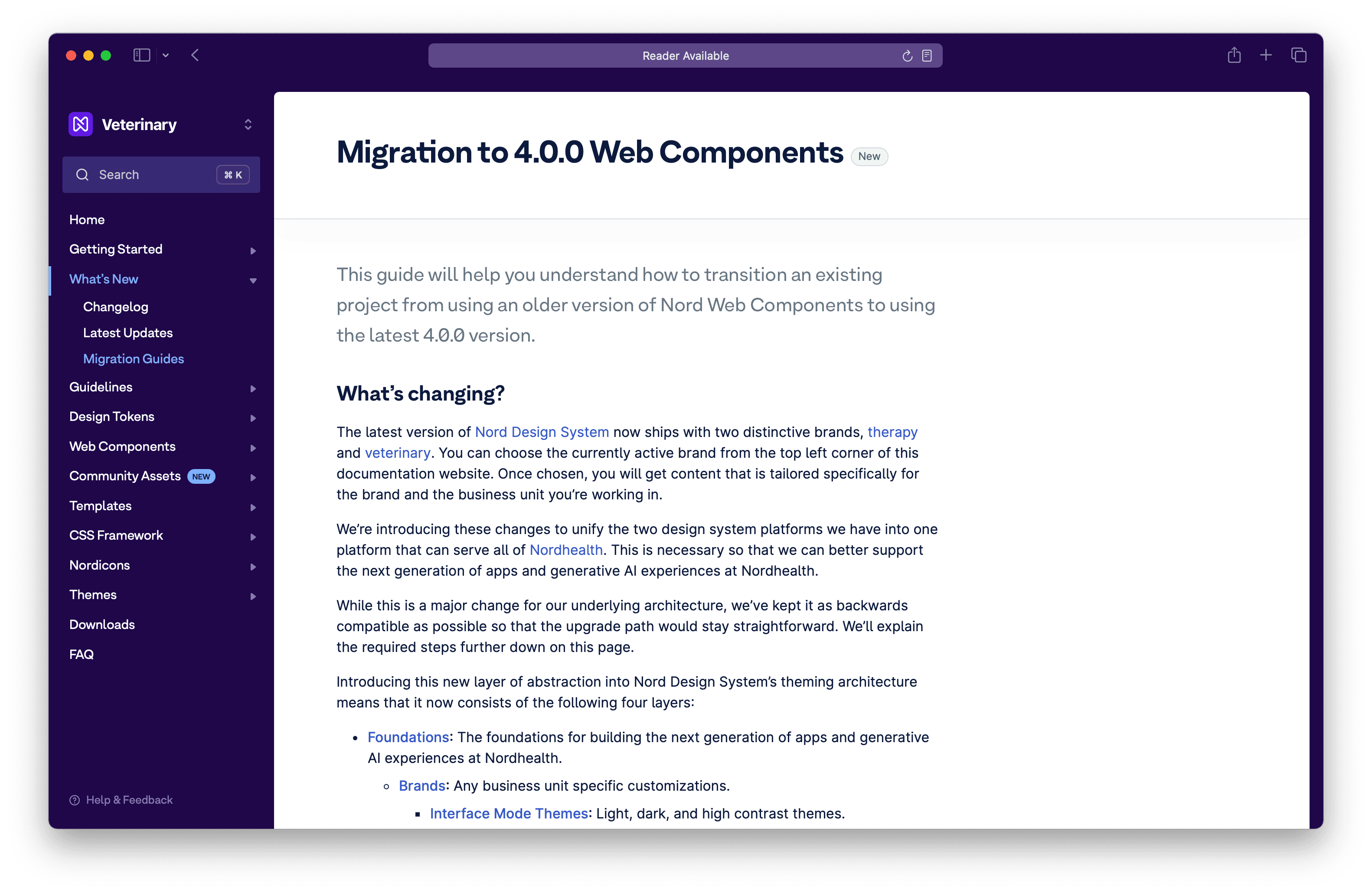 Migration guide for version 4.0 of Nord Design System.
Introducing Community Assets
We have introducing a completely new section for the documentation platform, called Community Assets. These are product-specific community assets from feature teams built using the Nord Design System’s tools. These are not part of the core system, but may eventually be migrated into Nord for usage across all products:
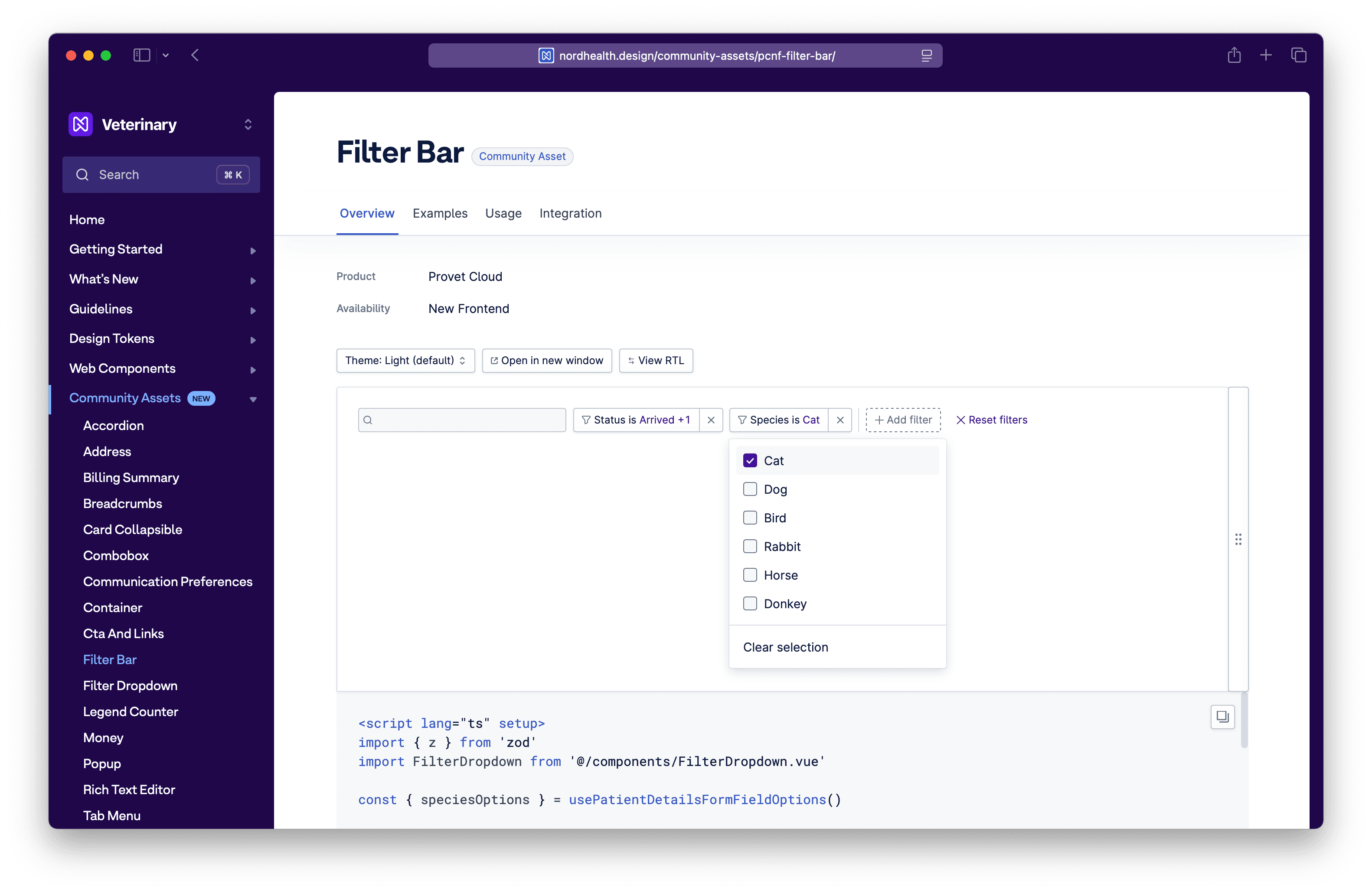 Community Assets in Nord Design System.
The high level aim here has been to enable the feature teams to be able to ship things faster, while also providing a platform that works as a single source of truth for both design and frontend related documentation.
Previously, without this functionality, one of two things kept happening:
- Firstly, the core design system started to become polluted with product-specific components and documentation, making the system unusable for the rest of the org.
- Secondly, the previous setup put the design system team in a role where we were sometimes slowing down the product development in order to prevent the feature teams from creating too much deviation from the existing design system conventions.
By introducing this new abstraction, we can more easily preserve the integrity of the core system while also letting feature teams do what they need within the same space and ship things faster.
Updated Theme Builder
We have updated the theme builder that I originally built for quickly testing out the accent color feature to support the latest theming architecture. Now you can test all new interface theme modes in one go:
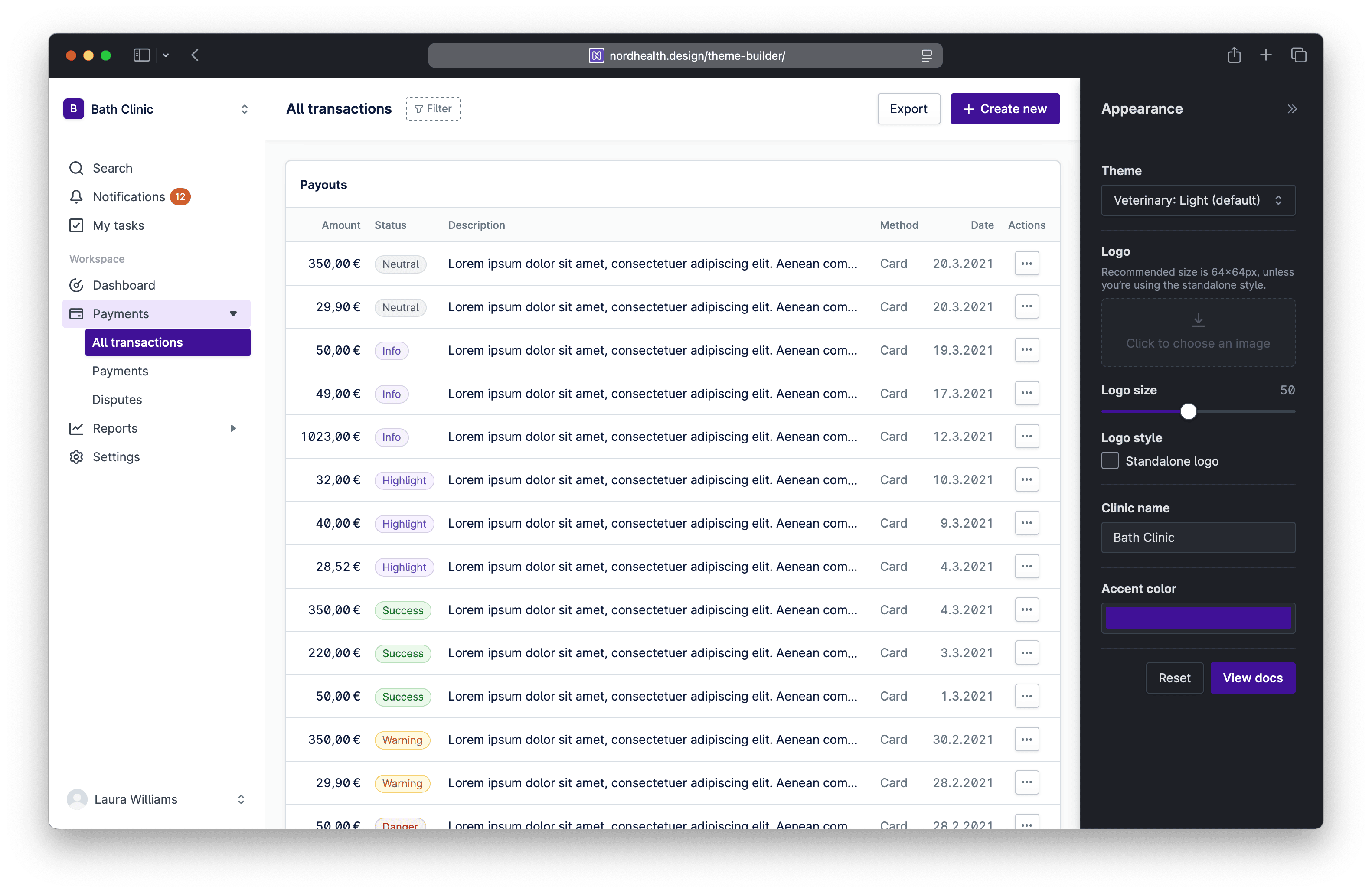 Theme Builder in Nord Design System.
Updated Color Generator
The color generator is a tool that generates color palettes programmatically for use with Nord Themes. I originally built this for developing our existing color palettes and testing out new color variations. Color generator now also supports the new interface theme modes:
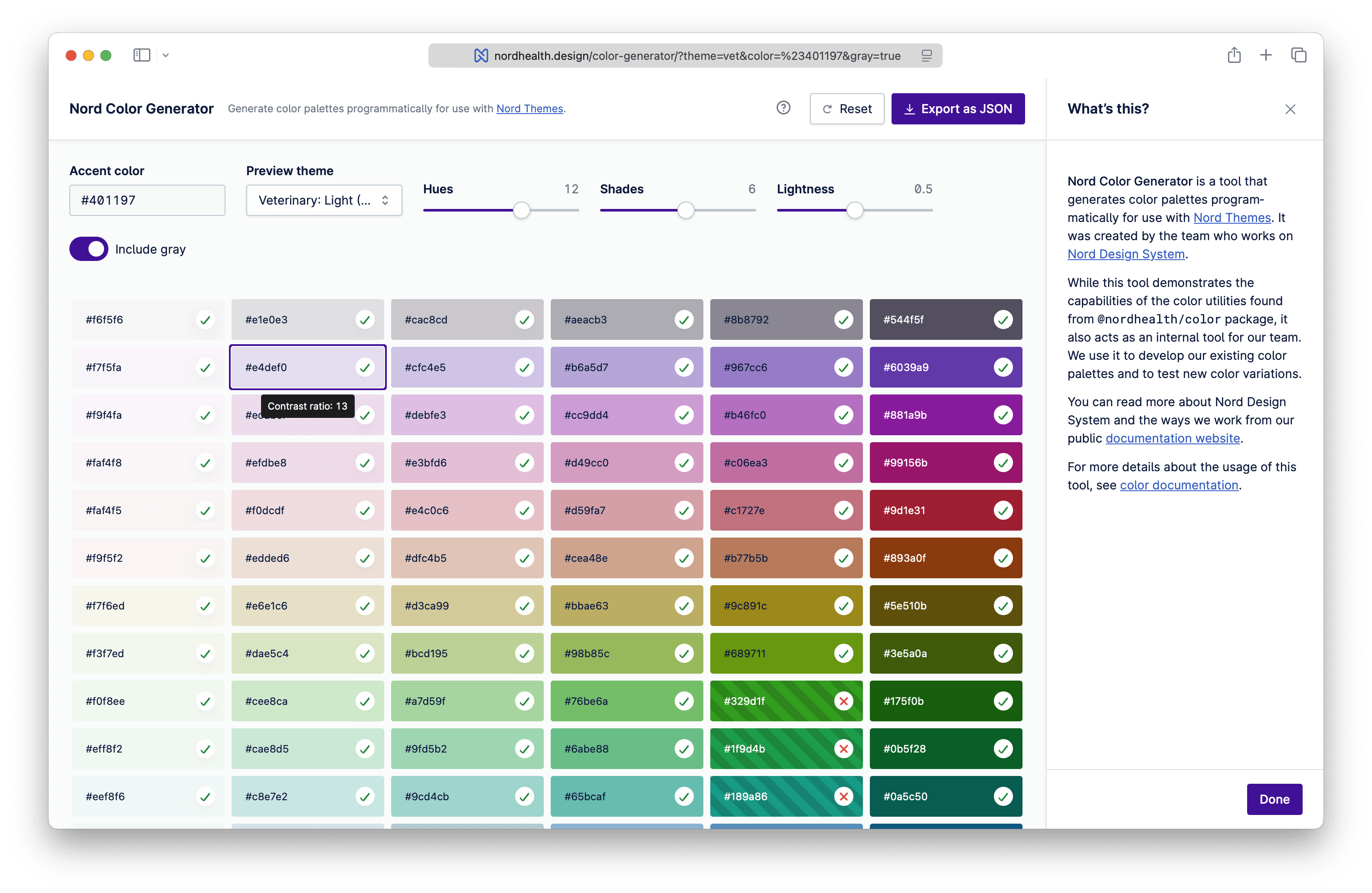 Color Generator in Nord Design System.
Improved Accessibility Checklist
Nord’s accessibility checklist also got some minor updates in this release. This is a tool that helps us improve the experience for everyone who uses our products and ensures our high standards for accessibility are met:
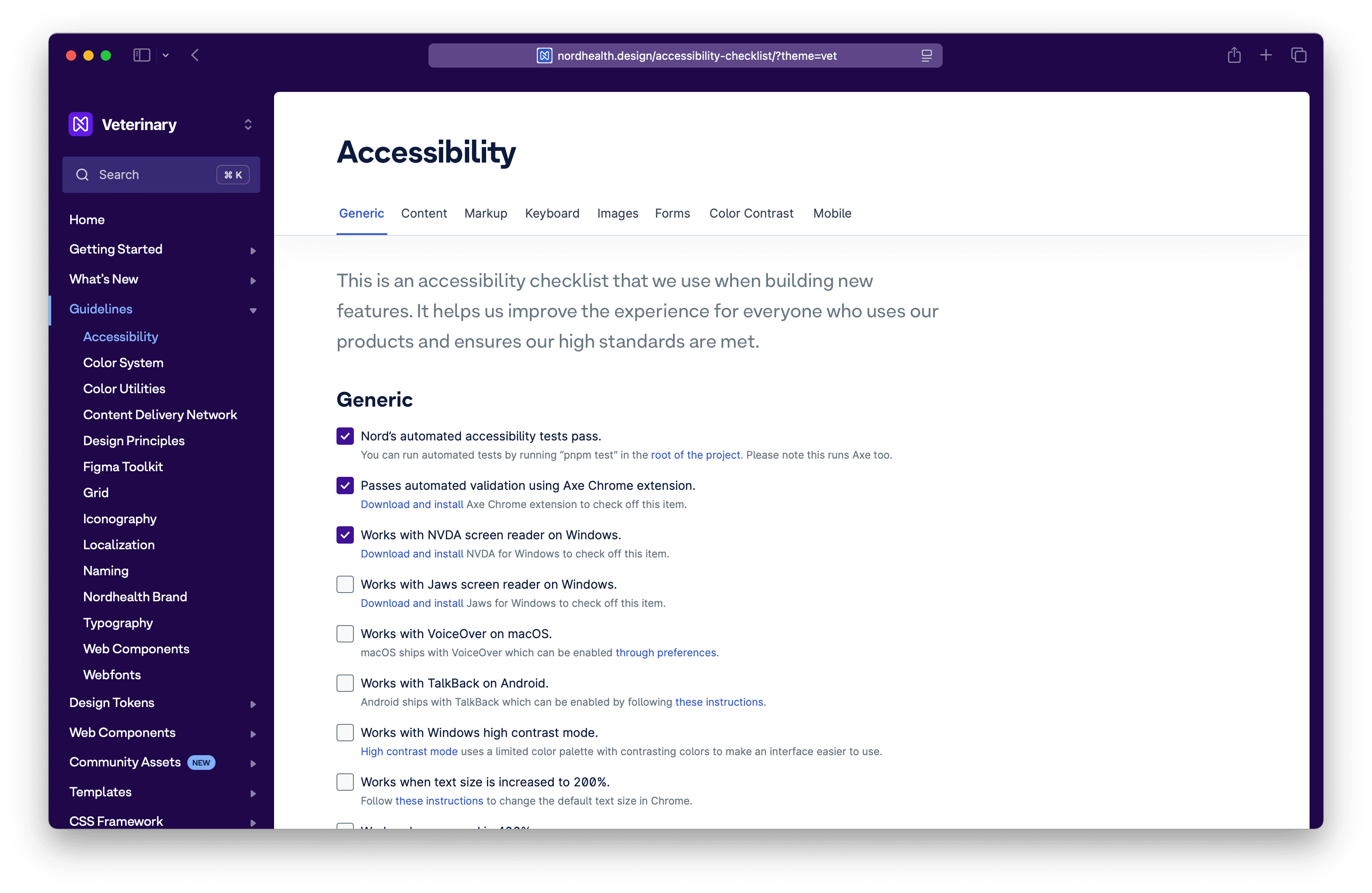 Accessibility Checklist in Nord Design System.
Deprecating React Components
With the recent release of React 19 and the added support for Custom Elements, we have decided to deprecate the @nordhealth/react package and it will be removed in the next major release.
For now, @nordhealth/react will continue to receive updates as its build is fully automated, but you should start planning on utilizing the @nordhealth/components package directly where possible as React now ships with full support for web components.
To continue having type checking and auto-completion in your JSX, you can use the new react.d.ts type definition file by adding the following to your tsconfig.json in a TypeScript project, or jsconfig.json in a JavaScript project:
{
  "compilerOptions": {
    "types": ["@nordhealth/components/lib/react.d.ts"]
  }
}
Deprecating Vue Types
To unify the experience of using Nord, we have also decided to make the Vue-specific types for our components part of the @nordhealth/components package and deprecate the separate @nordhealth/vue package.
The types can now be retrieved from the new vue.d.ts type definition file instead by adding the following to your tsconfig.json in a TypeScript project, or jsconfig.json in a JavaScript project:
{
  "compilerOptions": {
    "types": ["@nordhealth/components/lib/vue.d.ts"]
  }
}
Project Statistics
From a pure developer and codebase perspective, the new release and theming architecture introduced required the following over the six week period my colleague and I worked on it:
- Total of 233 commits
- 246 changed files
- 13 098 added lines of code
- 8 740 removed lines of code
- 200 new design tokens
- 6 weeks of time
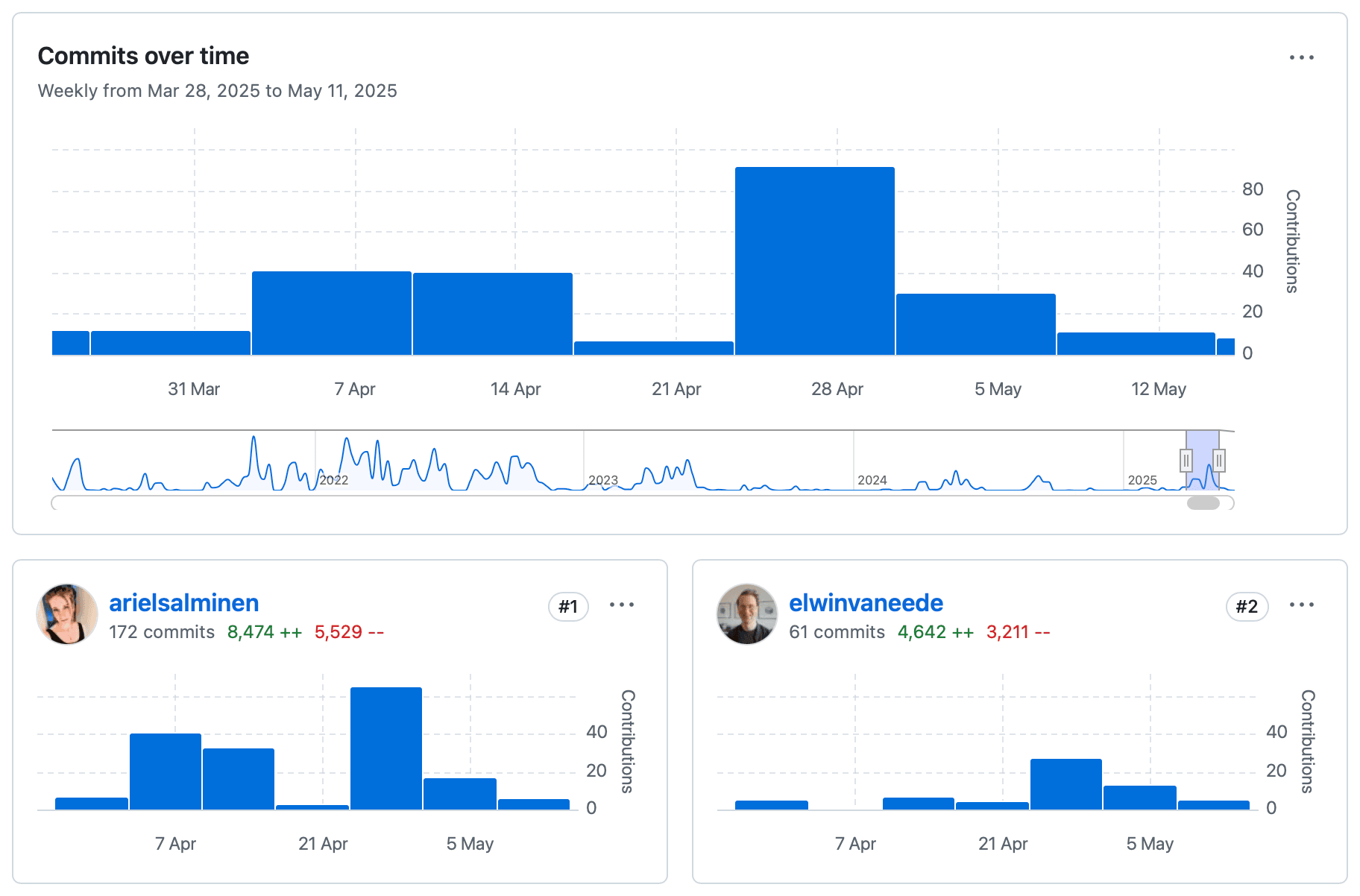 Project statistics from GitHub.
The added design tokens are purely coming from the number of interface mode themes added (4). In total, Nord Design System now has 448 design tokens split across the following categories:
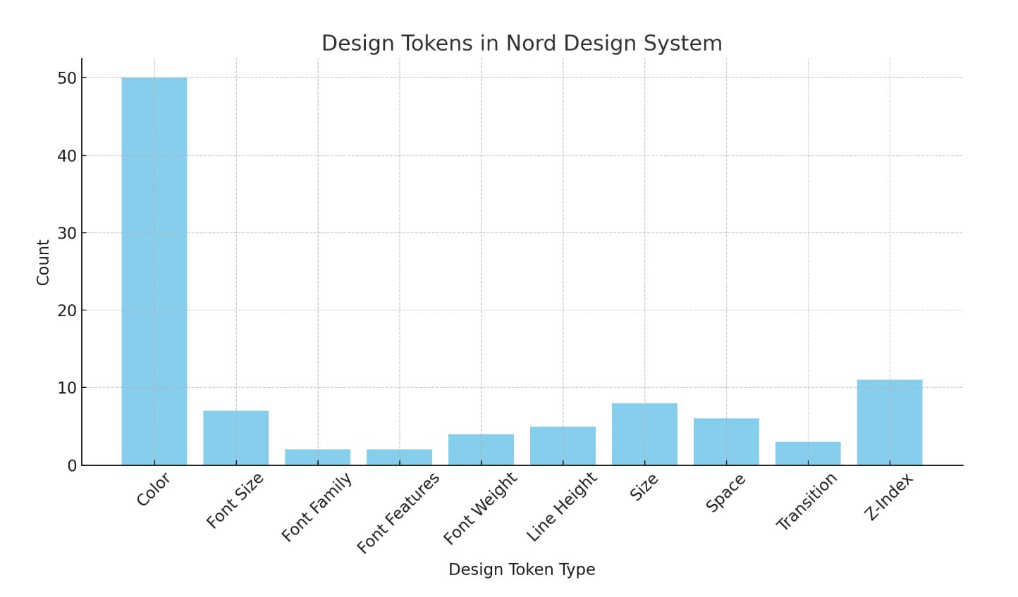 Design Tokens in Nord Design System.
For colors specifically, it is worth mentioning that many of them are aliases so the above bar chart may be a little misleading in that sense.
Conclusion
Nordhealth now has a design system platform that can better support the growing needs of the organization. The new platform supports creating specific guidelines and solutions for each business unit where needed. With this added flexibility they’re able to move quicker and it’s easier than ever for feature teams to contribute back to the design system.
Finally, if it wasn’t already obvious by looking at the documentation, we have also kept the orginal theme that you may have grown used to, but it has been polished ever so slightly:
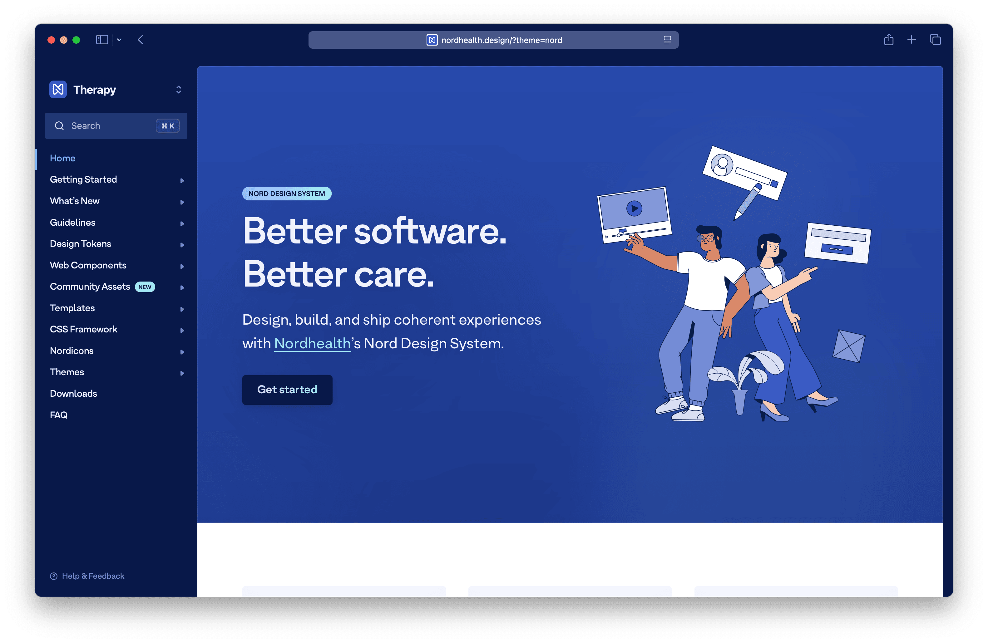 Version 4.0 of Nord Design System.
Have fun exploring the latest version of Nord Design System and let me know on LinkedIn or Bluesky if you have any questions. ✌🏻
Further Reading

