Design Tokens #
Design tokens are a tech-agnostic way to store variables. We use tokens instead of hard coded values to ensure a better UI consistency across different platforms.
Color
For consistency, we use the below defined color palette throughout our interface. Keep in mind that green, red and orange are only used in special cases like form validation and messaging.
| Example | Description | Token | Status |
|---|---|---|---|
|
#004d80 rgb(0, 77, 128) |
Primary Blue DarkDark version of primary blue that is accessible with white. Most commonly used to indicate hover and active states of an item with primary blue background. |
$color-primary-dark
var(--color-primary-dark)
|
|
|
#940925 rgb(148, 9, 37) |
Primary Red DarkDark version of primary red that is accessible with white. Most commonly used to indicate hover and active states of an item with primary red background. |
$color-primary-dark-turva
var(--color-primary-dark-turva)
|
|
|
#0077b3 rgb(0, 119, 179) |
Primary BluePrimary digital blue that is accessible with white. Used as primary button background color, selected state background color, and as link text color. |
$color-primary
var(--color-primary)
|
|
|
#c60c30 rgb(198, 12, 48) |
Primary RedPrimary digital red that is accessible with white. Used as primary button background color, selected state background color, and as link text color. |
$color-primary-turva
var(--color-primary-turva)
|
|
|
#cde5f1 rgb(205, 229, 241) |
Primary Blue LightLight blue that is 20% tint of the primary blue. Accessible when secondary blue is used as the text color. Used for date hovers and in-between date ranges. |
$color-primary-light
var(--color-primary-light)
|
|
|
#f4cfd6 rgb(244, 207, 214) |
Primary Red LightLight red that is 20% tint of the primary red. Accessible when secondary black is used as the text color. |
$color-primary-light-turva
var(--color-primary-light-turva)
|
|
|
#e6f2f8 rgb(230, 242, 248) |
Primary Blue LighterLight blue that is 10% tint of the primary blue. Accessible when secondary blue is used as the text color. Used for the dark end of background gradients. |
$color-primary-lighter
var(--color-primary-lighter)
|
|
|
#f9e6ea rgb(249, 230, 234) |
Primary Red LighterLight red that is 10% tint of the primary red. Accessible when secondary black is used as the text color. |
$color-primary-lighter-turva
var(--color-primary-lighter-turva)
|
|
|
#f3f9fc rgb(243, 249, 252) |
Primary Blue LightestLight blue that is 5% tint of the primary blue. Accessible when secondary blue is used as the text color. Commonly used to indicate a hover state of item with white background. |
$color-primary-lightest
var(--color-primary-lightest)
|
|
|
#fcf3f4 rgb(252, 243, 244) |
Primary Red LightestLight red that is 5% tint of the primary red. Accessible when secondary black is used as the text color. Commonly used to indicate a hover state of item with white background. |
$color-primary-lightest-turva
var(--color-primary-lightest-turva)
|
|
|
#00294d rgb(0, 41, 77) |
Secondary BlueSecondary blue that is accessible with light, lighter and lightest primary blue. Used as the body text color. |
$color-secondary
var(--color-secondary)
|
|
|
#171c3a rgb(23, 28, 58) |
Secondary BlackSecondary black that is accessible with light, lighter and lightest primary red. Used as the body text color. |
$color-secondary-turva
var(--color-secondary-turva)
|
|
|
#00a1d4 rgb(0, 161, 212) |
Brand BlueNon-accessible brand blue that is used in LocalTapiola logo and print materials. |
$color-brand-blue
var(--color-brand-blue)
|
|
|
#b2b4b3 rgb(178, 180, 179) |
Brand GrayNon-accessible brand gray that is used in Turva logo and print materials. |
$color-brand-gray-turva
var(--color-brand-gray-turva)
|
|
|
#de2362 rgb(222, 35, 98) |
Status DangerDanger red that is accessible with white. Only used in special cases like form validation and messaging. |
$color-danger
var(--color-danger)
|
|
|
#e02a0d rgb(224, 42, 13) |
Status DangerDanger red that is accessible with white. Only used in special cases like form validation and messaging. |
$color-danger-turva
var(--color-danger-turva)
|
|
|
#f7b228 rgb(247, 178, 40) |
Status WarningWarning orange (non-accessible) is only used in special cases like form validation and messaging. |
$color-warning
var(--color-warning)
|
|
|
#faa40f rgb(250, 164, 15) |
Status WarningWarning orange (non-accessible) is only used in special cases like form validation and messaging. |
$color-warning-turva
var(--color-warning-turva)
|
|
|
#00875a rgb(0, 135, 90) |
Status SuccessSuccess green that is accessible with white. Only used in special cases like form validation and messaging. |
$color-success
var(--color-success)
|
|
|
#08874e rgb(8, 135, 78) |
Status SuccessSuccess green that is accessible with white. Only used in special cases like form validation and messaging. |
$color-success-turva
var(--color-success-turva)
|
|
|
#454545 rgb(69, 69, 69) |
Gray DarkerDark gray that is accessible with white. Most commonly used as selected tab button background color. |
$color-gray-darker-turva
var(--color-gray-darker-turva)
|
|
|
#657787 rgb(101, 119, 135) |
Gray DarkerDarker gray that is accessible with white when used for text. Most commonly used as a text color for interface help texts. |
$color-gray-darker
var(--color-gray-darker)
|
|
|
#909599 rgb(144, 149, 153) |
Gray DarkDark gray is used for form borders that need to pass WCAG Level AA non-text contrast requirements. Please note that this color isn’t accessible when used for text. |
$color-gray-dark
var(--color-gray-dark)
|
|
|
#757575 rgb(117, 117, 117) |
Gray DarkDark gray that is accessible with white. Most commonly used to indicate inactive interface state. This color should also be used for borders that need to pass WCAG Level AA non-text contrast requirements. |
$color-gray-dark-turva
var(--color-gray-dark-turva)
|
|
|
#cfd2d4 rgb(207, 210, 212) |
GrayGray that is accessible with secondary blue. For consistency, we use this common grayscale palette throughout the interface. |
$color-gray
var(--color-gray)
|
|
|
#d1d1d1 rgb(209, 209, 209) |
GrayGray that is accessible with secondary black. For consistency, we use this common grayscale palette throughout the interface. |
$color-gray-turva
var(--color-gray-turva)
|
|
|
#e1e3e6 rgb(225, 227, 230) |
Gray LightLight gray that is accessible with secondary blue. For consistency, we use this common grayscale palette throughout the interface. |
$color-gray-light
var(--color-gray-light)
|
|
|
#e6e6e6 rgb(230, 230, 230) |
Gray LightLight gray that is accessible with secondary black. For consistency, we use this common grayscale palette throughout the interface. |
$color-gray-light-turva
var(--color-gray-light-turva)
|
|
|
#f5f8fa rgb(245, 248, 250) |
Gray LighterLight gray that is accessible with secondary blue. For consistency, we use this common grayscale palette throughout the interface. |
$color-gray-lighter
var(--color-gray-lighter)
|
|
|
#f7f7f7 rgb(247, 247, 247) |
Gray LighterLight gray that is accessible with secondary black. For consistency, we use this common grayscale palette throughout the interface. |
$color-gray-lighter-turva
var(--color-gray-lighter-turva)
|
|
|
#ffffff rgb(255, 255, 255) |
Gray LightestWhite is used as the primary page background color and primary container background color. |
$color-gray-lightest
var(--color-gray-lightest)
|
|
|
#ffffff rgb(255, 255, 255) |
Gray LightestWhite is used as the primary page background color and primary container background color. |
$color-gray-lightest-turva
var(--color-gray-lightest-turva)
|
|
|
#098194 rgb(9, 129, 148) |
Category TravelTravel category color that is accessible with white. Should be only used within the travel product category and icons (or similar) representing it. |
$color-category-travel-turva
var(--color-category-travel-turva)
|
|
|
#0b7288 rgb(11, 114, 136) |
Category FamilyFamily category color that is accessible with white. Should be only used within the family product category and icons (or similar) representing it. |
$color-category-family
var(--color-category-family)
|
|
|
#171c3a rgb(23, 28, 58) |
Category VehicleVehicle category color that is accessible with white. Should be only used within the vehicle/mobility product category and icons (or similar) representing it. |
$color-category-vehicle-turva
var(--color-category-vehicle-turva)
|
|
|
#364a81 rgb(54, 74, 129) |
Category VehicleVehicle category color that is accessible with white. Should be only used within the vehicle/mobility product category and icons (or similar) representing it. |
$color-category-vehicle
var(--color-category-vehicle)
|
|
|
#7a01c4 rgb(122, 1, 196) |
Category FinanceFinance category color that is accessible with white. Should be only used within the finance product category and icons (or similar) representing it. |
$color-category-finance
var(--color-category-finance)
|
|
|
#a10a4e rgb(161, 10, 78) |
Category HomeHome category color that is accessible with white. Should be only used within the home product category and icons (or similar) representing it. |
$color-category-home-turva
var(--color-category-home-turva)
|
|
|
#a8014e rgb(168, 1, 78) |
Category PetPet category color that is accessible with white. Should be only used within the pet product category and icons (or similar) representing it. |
$color-category-pet
var(--color-category-pet)
|
|
|
#a9457c rgb(169, 69, 124) |
Category UnionUnion category color that is accessible with white. Should be only used within the union product category and icons (or similar) representing it. |
$color-category-union-turva
var(--color-category-union-turva)
|
|
|
#c70c70 rgb(199, 12, 112) |
Category FamilyFamily category color that is accessible with white. Should be only used within the family product category and icons (or similar) representing it. |
$color-category-family-turva
var(--color-category-family-turva)
|
|
|
#d32483 rgb(211, 36, 131) |
Category HomeHome category color that is accessible with white. Should be only used within the home product category and icons (or similar) representing it. |
$color-category-home
var(--color-category-home)
|
|
|
#d54203 rgb(213, 66, 3) |
Category TravelTravel category color that is accessible with white. Should be only used within the travel product category and icons (or similar) representing it. |
$color-category-travel
var(--color-category-travel)
|
|
Ready, can be used in production.
 In Review, ready to be used soon.
 Prototype, do not use.
Data Visualization
The below defined color palette is meant for data visualizations only. It is designed to meet the accessibility requirements and work together with our main color palette above.
| Example | Description | Token | Status |
|---|---|---|---|
|
7.99
#7a01c4 rgb(122, 1, 196) |
Data 01Data visualization color that is accessible with white. Please note that this color should not be used for any other purpose. |
$color-data-01
var(--color-data-01)
|
|
|
3.2
#009bcc rgb(0, 155, 204) |
Data 02Data visualization color that is accessible with white. Please note that this color should not be used for any other purpose. |
$color-data-02
var(--color-data-02)
|
|
|
3.01
#1bab4b rgb(27, 171, 75) |
Data 03Data visualization color that is accessible with white. Please note that this color should not be used for any other purpose. |
$color-data-03
var(--color-data-03)
|
|
|
3.18
#ff5622 rgb(255, 86, 34) |
Data 04Data visualization color that is accessible with white. Please note that this color should not be used for any other purpose. |
$color-data-04
var(--color-data-04)
|
|
|
3.29
#f54c9a rgb(245, 76, 154) |
Data 05Data visualization color that is accessible with white. Please note that this color should not be used for any other purpose. |
$color-data-05
var(--color-data-05)
|
|
|
5.85
#c21565 rgb(194, 21, 101) |
Data 06Data visualization color that is accessible with white. Please note that this color should not be used for any other purpose. |
$color-data-06
var(--color-data-06)
|
|
|
3.26
#c065f7 rgb(192, 101, 247) |
Data 07Data visualization color that is accessible with white. Please note that this color should not be used for any other purpose. |
$color-data-07
var(--color-data-07)
|
|
|
5.57
#0069bf rgb(0, 105, 191) |
Data 08Data visualization color that is accessible with white. Please note that this color should not be used for any other purpose. |
$color-data-08
var(--color-data-08)
|
|
|
5.58
#137835 rgb(19, 120, 53) |
Data 09Data visualization color that is accessible with white. Please note that this color should not be used for any other purpose. |
$color-data-09
var(--color-data-09)
|
|
|
5.87
#b33c18 rgb(179, 60, 24) |
Data 10Data visualization color that is accessible with white. Please note that this color should not be used for any other purpose. |
$color-data-10
var(--color-data-10)
|
|
|
3.09
#0da3A6 rgb(13, 163, 166) |
Data 11Data visualization color that is accessible with white. Please note that this color should not be used for any other purpose. |
$color-data-11
var(--color-data-11)
|
|
|
5.56
#0b7288 rgb(11, 114, 136) |
Data 12Data visualization color that is accessible with white. Please note that this color should not be used for any other purpose. |
$color-data-12
var(--color-data-12)
|
|
|
3.23
#b38918 rgb(179, 137, 24) |
Data 13Data visualization color that is accessible with white. Please note that this color should not be used for any other purpose. |
$color-data-13
var(--color-data-13)
|
|
|
5.72
#806211 rgb(128, 98, 17) |
Data 14Data visualization color that is accessible with white. Please note that this color should not be used for any other purpose. |
$color-data-14
var(--color-data-14)
|
|
|
14.74
#00294d rgb(0, 41, 77) |
Data 15Data visualization color that is accessible with white. Please note that this color should not be used for any other purpose. |
$color-data-15
var(--color-data-15)
|
|
Fonts
Text is interface, which is why we’ve spent a great amount of time fine-tuning our typographic choices. Use the below tokens to set font-families, font-weights and letter-spacing consistently.
| Example | Description | Token | Status |
|---|---|---|---|
'localtapiola-sans', -apple-system, BlinkMacSystemFont, 'Segoe UI', Roboto, Helvetica, Arial, sans-serif, 'Apple Color Emoji', 'Segoe UI Emoji', 'Segoe UI Symbol' |
Font Family: HeadingHeading font family uses a font stack that gracefully degrades to default system fonts on different platforms. Should be used for headings only. |
$font-family-heading
var(--font-family-heading)
|
|
'localtapiola-sans', -apple-system, BlinkMacSystemFont, 'Segoe UI', Roboto, Helvetica, Arial, sans-serif, 'Apple Color Emoji', 'Segoe UI Emoji', 'Segoe UI Symbol' |
Font Family: TextText font family uses a font stack that gracefully degrades to default system fonts on different platforms. Should be used for body text and form controls. |
$font-family-text
var(--font-family-text)
|
|
'turva-sans', -apple-system, BlinkMacSystemFont, 'Segoe UI', Roboto, Helvetica, Arial, sans-serif, 'Apple Color Emoji', 'Segoe UI Emoji', 'Segoe UI Symbol' |
Font Family: HeadingHeading font family uses a font stack that gracefully degrades to default system fonts on different platforms. Should be used for headings only. |
$font-family-heading-turva
var(--font-family-heading-turva)
|
|
'turva-sans', -apple-system, BlinkMacSystemFont, 'Segoe UI', Roboto, Helvetica, Arial, sans-serif, 'Apple Color Emoji', 'Segoe UI Emoji', 'Segoe UI Symbol' |
Font Family: TextText font family uses a font stack that gracefully degrades to default system fonts on different platforms. Should be used for body text and form controls. |
$font-family-text-turva
var(--font-family-text-turva)
|
|
-0.01rem |
Letter Spacing: HeadingGives tiny amount of negative letter spacing for the page main heading. |
$letter-spacing-heading
var(--letter-spacing-heading)
|
|
400 |
Font Weight: NormalNormal font weight is used for body text and form inputs together with “Text” font family. |
$font-weight-normal
var(--font-weight-normal)
|
|
600 |
Font Weight: Semi BoldSemi bold font weight is used for buttons and sub headings together with “Text” font family. |
$font-weight-semi-bold
var(--font-weight-semi-bold)
|
|
700 |
Font Weight: BoldBold font weight is used for headings only together with “Heading” font family. |
$font-weight-bold
var(--font-weight-bold)
|
|
800 |
Font Weight: Extra BoldExtra bold font weight is used for headings only together with “Heading” font family. |
$font-weight-extra-bold
var(--font-weight-extra-bold)
|
|
Font Size
Duet’s typographic scale is designed to work in sync with its spacing scale. These tokens should be used for all font sizes throughout the interface to create a predictable and harmonious typographic style.
| Example | Description | Token | Status |
|---|---|---|---|
|
Aa
0.75rem
|
Font Size: X-SmallX-Small font size that is only used in native iOS and Android applications. |
$font-size-x-small
var(--font-size-x-small)
|
|
|
Aa
0.875rem
|
Font Size: SmallSmall font size should be used sparingly for annotations, descriptions, and similar content. |
$font-size-small
var(--font-size-small)
|
|
|
Aa
1rem
|
Font Size: MediumMedium font size is used for the body text. |
$font-size-medium
var(--font-size-medium)
|
|
|
Aa
1.25rem
|
Font Size: LargeLarge font size is used for small sub-headings. |
$font-size-large
var(--font-size-large)
|
|
|
Aa
1.5rem
|
Font Size: X-LargeX-large font size is used for large sub-headings. |
$font-size-x-large
var(--font-size-x-large)
|
|
|
Aa
2.25rem
|
Font Size: XX-LargeXX-large font size is used for the main heading on tablet size. |
$font-size-xx-large
var(--font-size-xx-large)
|
|
|
Aa
3rem
|
Font Size: XXX-LargeXXX-large font size is used for the main heading on desktop. |
$font-size-xxx-large
var(--font-size-xxx-large)
|
|
|
Aa
4.5rem
|
Font Size: XXXX-LargeXXXX-large font size is for marketing purposes and banners. |
$font-size-xxxx-large
var(--font-size-xxxx-large)
|
|
Border Radius
Border-radius is used to give any element rounded corners. Use the below defined tokens to set radiuses consistently.
| Example | Description | Token | Status |
|---|---|---|---|
|
0 |
Border Radius: SharpSharp border-radius resets the corners to be sharp with no rounding. |
$radius-sharp
var(--radius-sharp)
|
|
|
20rem |
Border Radius: PillPill border-radius is the default radius for buttons, tags, tabs, and similar. |
$radius-pill
var(--radius-pill)
|
|
|
4px |
Border Radius: DefaultDefault border-radius is used in interface containers, form inputs, textareas, and similar. If you’re unsure which radius to use, pick the default. |
$radius-default
var(--radius-default)
|
|
|
50% |
Border Radius: CircleCircle border-radius is used as icon background shape and as avatar shape. |
$radius-circle
var(--radius-circle)
|
|
Box Shadow
Box-shadows are used to cast shadows from interface elements. Use the below defined tokens to set shadows consistently.
| Example | Description | Token | Status |
|---|---|---|---|
|
0 2px 10px 0 rgba(0, 41, 77, 0.07) |
Shadow: TooltipTooltip shadow is used by popover tooltips. |
$shadow-tooltip
var(--shadow-tooltip)
|
|
|
0 2px 10px 0 rgba(0, 41, 77, 0.1) |
Shadow: HoverHover shadow is used when primary component is clickable and is hovered over/active on mobile. |
$shadow-hover
var(--shadow-hover)
|
|
|
0 2px 10px 0 rgba(117, 117, 117, 0.13) |
Shadow: TooltipTooltip shadow is used by popover tooltips. |
$shadow-tooltip-turva
var(--shadow-tooltip-turva)
|
|
|
0 2px 10px 0 rgba(117, 117, 117, 0.15) |
Shadow: HoverHover shadow is used when primary component is clickable and is hovered over/active on mobile. |
$shadow-hover-turva
var(--shadow-hover-turva)
|
|
|
0 2px 20px 0 rgba(0, 0, 0, 0.2) |
Shadow: ModalModal shadow is used for popovers and modal windows on a dark blue overlay. |
$shadow-modal
var(--shadow-modal)
|
|
|
0 2px 6px 0 rgba(0, 41, 77, 0.07) |
Shadow: DefaultDefault shadow style. |
$shadow-default
var(--shadow-default)
|
|
|
0 2px 6px 0 rgba(0, 41, 77, 0.07), 0 -1px 0 0 rgba(0, 0, 0, 0.09), -1px 0 0 0 rgba(0, 0, 0, 0.07), 1px 0 0 0 rgba(0, 0, 0, 0.07), 0 1px 0 0 rgba(0, 0, 0, 0.07) |
Shadow: CardCard shadow is a variant of default shadow that is used when information needs to be contained within a card. |
$shadow-card
var(--shadow-card)
|
|
|
0 2px 6px 0 rgba(117, 117, 117, 0.13) |
Shadow: DefaultDefault shadow is used when information needs to be contained within a component. |
$shadow-default-turva
var(--shadow-default-turva)
|
|
|
0 2px 6px 0 rgba(117, 117, 117, 0.13), 0 -1px 0 0 rgba(0, 0, 0, 0.09), -1px 0 0 0 rgba(0, 0, 0, 0.07), 1px 0 0 0 rgba(0, 0, 0, 0.07), 0 1px 0 0 rgba(0, 0, 0, 0.07) |
Shadow: CardCard shadow is a variant of default shadow that is used when information needs to be contained within a card. |
$shadow-card-turva
var(--shadow-card-turva)
|
|
Space
We use the below defined tokens to create a predictable and harmonious spacing for our interface. These tokens should be used for all padding, margin and position coordinates. Multiplying and dividing these values is allowed using even numbers (*2 *4 or /2 /4 etc).
| Example | Description | Token | Status |
|---|---|---|---|
|
2px |
Space: XXX-SmallXXX-small space is used when the space is limited. |
$space-xxx-small
var(--space-xxx-small)
|
|
|
4px |
Space: XX-SmallXX-small space is used when the space is limited. |
$space-xx-small
var(--space-xx-small)
|
|
|
8px |
Space: X-SmallX-small space is used when the space is limited. |
$space-x-small
var(--space-x-small)
|
|
|
12px |
Space: SmallSmall space is used when the space is limited and for example in popover datepicker. |
$space-small
var(--space-small)
|
|
|
16px |
Space: MediumMedium is the default space. |
$space-medium
var(--space-medium)
|
|
|
20px |
Space: LargeLarge space is most commonly used as an empty space between two components. |
$space-large
var(--space-large)
|
|
|
28px |
Space: X-LargeX-large space is used as an empty space between two elements. |
$space-x-large
var(--space-x-large)
|
|
|
36px |
Space: XX-LargeXX-large space is used as horizontal padding in buttons and as an empty space between two elements. |
$space-xx-large
var(--space-xx-large)
|
|
|
48px |
Space: XXX-LargeXXX-large space is used as an empty space between two elements. |
$space-xxx-large
var(--space-xxx-large)
|
|
|
72px |
Space: XXXX-LargeXXXX-large space is used as an empty space between two elements. |
$space-xxxx-large
var(--space-xxxx-large)
|
|
Sizes
Size tokens are used to set element sizes according to Duet’s sizing scale. Can be used for both the width and height properties.
| Example | Description | Token | Status |
|---|---|---|---|
|
7px |
Size: Icon XXX-SmallXXX-small icon size is used when the space is limited. |
$size-icon-xxx-small
var(--size-icon-xxx-small)
|
|
|
10px |
Size: Icon XX-SmallXX-small icon size is used when the space is limited. |
$size-icon-xx-small
var(--size-icon-xx-small)
|
|
|
16px |
Size: Icon X-SmallX-small icon size is used when the space is limited. |
$size-icon-x-small
var(--size-icon-x-small)
|
|
|
20px |
Size: Icon SmallSmall icon size is used with text links, buttons, inside forms, and in global navigation. |
$size-icon-small
var(--size-icon-small)
|
|
|
24px |
Size: Icon MediumMedium icon size is the standard icon size. Used for example in primary selections. |
$size-icon-medium
var(--size-icon-medium)
|
|
|
30px |
Size: Icon LargeLarge icon size is used for insurance categories in mobile, small product levels, and card icons. |
$size-icon-large
var(--size-icon-large)
|
|
|
36px |
Size: Icon X-LargeX-large icon size is used as product level icons. |
$size-icon-x-large
var(--size-icon-x-large)
|
|
|
48px |
Size: Icon XX-LargeXX-large icon size is used in components as a visual element. |
$size-icon-xx-large
var(--size-icon-xx-large)
|
|
|
72px |
Size: Icon XXX-LargeXXX-large icon size is used for insurance categories in desktop and to visualise feedback overlays. |
$size-icon-xxx-large
var(--size-icon-xxx-large)
|
|
|
1110px |
Size: Layout Max-WidthThis size is used as the max-width for all layouts on the Web. |
$size-layout-max-width
var(--size-layout-max-width)
|
|
|
1px |
Size: Form BorderForm border size is used to set a consistent borders for form elements. |
$size-form-border
var(--size-form-border)
|
|
|
2px |
Size: Button BorderButton border size is used to set a consistent borders for buttons. |
$size-button-border
var(--size-button-border)
|
|
|
30px |
Size: Step SmallSmall step size is used for stepper circles that have icon inside them (mobile viewports). |
$size-step-small
var(--size-step-small)
|
|
|
3rem |
Size: NavigationNavigation size (48px) is used for the navigation height on desktop viewports. |
$size-navigation
var(--size-navigation)
|
|
|
40px |
Size: Step MediumMedium step size is used for stepper circles that have icon inside them (desktop viewports). |
$size-step-medium
var(--size-step-medium)
|
|
|
48px |
Size: Tappable SquareA minimum recommended touch target size is 48 device independent pixels on a website with a properly set mobile viewport. |
$size-tappable-square
var(--size-tappable-square)
|
|
|
4rem |
Size: HeaderHeader size (64px) is used for the header height on mobile, tablet and desktop viewports. |
$size-header
var(--size-header)
|
|
|
8rem |
Size: Button Min WidthButton min width size is used to set the minimum width for button elements. |
$size-button-min-width
var(--size-button-min-width)
|
|
Opacity
The opacity property specifies how transparent an element is. Use the below defined tokens to set transparencies consistently.
| Example | Description | Token | Status |
|---|---|---|---|
|
0.30 |
Opacity: 30%Gives 30% opacity to an element. |
$opacity-30
var(--opacity-30)
|
|
|
0.50 |
Opacity: 50%Gives 50% opacity to an element. |
$opacity-50
var(--opacity-50)
|
|
|
0.75 |
Opacity: 75%Gives 75% opacity to an element. |
$opacity-75
var(--opacity-75)
|
|
|
0.85 |
Opacity: 85%Gives 85% opacity to an element. |
$opacity-85
var(--opacity-85)
|
|
Z Index
Managing vertical stacking order across large websites and applications can be a painful experience. That’s why Duet includes a predefined system to make handling of z-indexes easier.
| Example | Description | Token | Status |
|---|---|---|---|
-999999 |
Z-Index: DeepDeep z-index is used to stack something behind everything else. |
$z-index-deep
var(--z-index-deep)
|
|
1 |
Z-Index: DefaultThe default z-index for components and elements inside components. |
$z-index-default
var(--z-index-default)
|
|
100 |
Z-Index: MaskedDefault z-index for masked interface elements. |
$z-index-masked
var(--z-index-masked)
|
|
200 |
Z-Index: MaskDefault z-index for masking interface elements. |
$z-index-mask
var(--z-index-mask)
|
|
300 |
Z-Index: StickyDefault z-index for sticky interface elements. |
$z-index-sticky
var(--z-index-sticky)
|
|
400 |
Z-Index: HeaderDefault z-index for header. |
$z-index-header
var(--z-index-header)
|
|
500 |
Z-Index: ToastDefault z-index for toast messages. |
$z-index-toast
var(--z-index-toast)
|
|
600 |
Z-Index: DropdownDefault z-index for dropdowns which makes sure the dropdown stacks above toasts and sticky elements. |
$z-index-dropdown
var(--z-index-dropdown)
|
|
700 |
Z-Index: OverlayDefault z-index for modal and popup overlays. |
$z-index-overlay
var(--z-index-overlay)
|
|
800 |
Z-Index: SpinnerDefault z-index for spinners, stacking on top of overlay. |
$z-index-spinner
var(--z-index-spinner)
|
|
900 |
Z-Index: ModalDefault z-index for modals that stacks on top of overlays and other elements, but still allows popups to be visible. |
$z-index-modal
var(--z-index-modal)
|
|
950 |
Z-Index: PopupDefault z-index for popups that stacks on top of all other elements. |
$z-index-popup
var(--z-index-popup)
|
|
Line Height
Line-height property defines the amount of space above and below inline elements. Duet uses “unitless” values to define line-heights, which ensures that the line-height is always relative to the used font-size.
| Example | Description | Token | Status |
|---|---|---|---|
|
1.1 renders as 17.6px with 16px font.
1.1 |
Line Height: X-SmallX-small line-height is used when we don’t want the line-height to create any additional white space above or below text. |
$line-height-x-small
var(--line-height-x-small)
|
|
|
1.25 renders as 20px with 16px font.
1.25 |
Line Height: SmallSmall line-height is used for all application headings and text in sidebar. |
$line-height-small
var(--line-height-small)
|
|
|
1.5 renders as 24px with 16px font.
1.5 |
Line Height: MediumMedium line-height is used for the main body text. Basically everything else except the headings and sidebar (and a few other exceptions). |
$line-height-medium
var(--line-height-medium)
|
|
Transition
We use transitions to add a sense of playfulness and delight to our interface. Transitions also hint at functionality and inform the user's mental model of how an interface functions.
| Example | Description | Token | Status |
|---|---|---|---|
300ms ease |
Transition: QuicklyUse this design token for a quick transition. Most often used for button, link and form input hover effects. |
$transition-quickly
var(--transition-quickly)
|
|
600ms ease |
Transition: SlowlyUse this design token for a slow transition. Used for example in mobile navigation. |
$transition-slowly
var(--transition-slowly)
|
|
Media Query
Media queries are useful when you want to modify your application depending on the user’s screen size. Use the below defined tokens to set media queries consistently when building websites mobile first.
| Example | Description | Token | Status |
|---|---|---|---|
'(max-width: 22.5em)' |
Media Query: XX-SmallXX-Small media query is used to target the smallest devices between 0-360px. Remember that in most cases the XX-Small media query is rarely needed when building websites mobile first. |
$media-query-xx-small
var(--media-query-xx-small)
|
|
'(max-width: 35.9375em)' |
Media Query: X-SmallX-Small media query is used to target smaller devices between 0-575px. Remember that in most cases the X-Small media query is rarely needed when building websites mobile first. |
$media-query-x-small
var(--media-query-x-small)
|
|
'(min-width: 36em)' |
Media Query: SmallSmall media query is used to target devices from 576px and up. When working mobile first, this is your first breakpoint when the viewport width grows. |
$media-query-small
var(--media-query-small)
|
|
'(min-width: 48em)' |
Media Query: MediumMedium media query is used to target portrait tablets from 768px and up. |
$media-query-medium
var(--media-query-medium)
|
|
'(min-width: 62em)' |
Media Query: LargeLarge media query is used to target landscape tablets from 992px and up. |
$media-query-large
var(--media-query-large)
|
|
'(min-width: 64.0625em)' |
Media Query: X-LargeX-Large media query is used to target desktop devices from 1025px and up. |
$media-query-x-large
var(--media-query-x-large)
|
|
'(min-width: 76.25em)' |
Media Query: XX-LargeXX-Large media query is used to target large desktop devices from 1220px and up. |
$media-query-xx-large
var(--media-query-xx-large)
|
|
'(min-width: 106.25em)' |
Media Query: XXX-LargeXXX-Large media query is used to target very large desktop devices from 1700px and up. |
$media-query-xxx-large
var(--media-query-xxx-large)
|
|
About #
Design tokens are a central location to store design related information such as colors, fonts, sizes and transitions. These raw values are automatically transformed to different formats like Sass, CSS, JSON and more.
Duet Design System uses design tokens instead of hard coded values to ensure a better UI consistency across different platforms.
Installation #
Before moving further, please make sure you have Node.js installed on your machine. You can install the latest version through their website.
If you’re planning on using Duet Design Tokens in a project that doesn’t yet use Node Package Manager, you’ll have to first create a package.json file. To do this, run npm init and follow the steps provided. Once finished, you can install Duet Design Tokens by following the instructions below.
Install using NPM #
Run in your project or website root directory (where package.json lives):
npm install @duetds/tokensInstall using Yarn #
Run in your project or website root directory (where package.json lives):
yarn add @duetds/tokensUsage #
You can find a list of all available design tokens in Duet Design Tokens documentation.
Importing in JavaScript #
In JavaScript, token names are formatted in lower camelCase. To import the design tokens, require the provided common.js module:
// Import design tokens
const tokens = require("@duetds/tokens");

// Console.log primary color value
console.log(tokens.colorPrimary);
In JSON, design token names are formatted in snake_case:
// Import design tokens
const tokens = require("@duetds/tokens/lib/tokens.json");

// Console.log primary color value
console.log(tokens["color_primary"]);
If your project supports ECMAScript Modules, you can also use the import syntax:
// Import design tokens
import * as tokens from "@duetds/tokens";

// …or… import a single design token
import { colorPrimary } from "@duetds/tokens";
Importing in Sass #
Sass variables and map keys are formatted in kebab-case. There’re a few ways to import them. The simplest way is to reference and import the tokens partial directly:
// Import as basic variables
@import "~@duetds/tokens/lib/tokens.scss";

.example {
  color: $color-primary;
}

// Import a Sass map of all tokens
@import "~@duetds/tokens/lib/tokens.map.scss";

.example {
  color: map-get($tokens-map, "color-primary");
}
If you’re not using Webpack or similar tool for your build process, you may have to provide the full path to Node Modules:
// Import as basic variables
@import "/work/duet-design-system/node_modules/@duetds/tokens/lib/tokens.scss";

.example {
  color: $color-primary;
}
Importing CSS Custom Properties #
CSS Custom properties (sometimes referred to as CSS variables) are useful for prototyping and when we don’t have to support older Internet Explorers. You can import them in plain CSS or Sass:
// Import as CSS variables
@import "~@duetds/tokens/lib/tokens.custom-properties.css";

.example {
  color: var(--color-primary);
}
Importing in HTML #
CSS Custom properties can be imported in HTML as well:
<link rel="stylesheet" href="tokens.custom-properties.css" />Importing in Sketch #
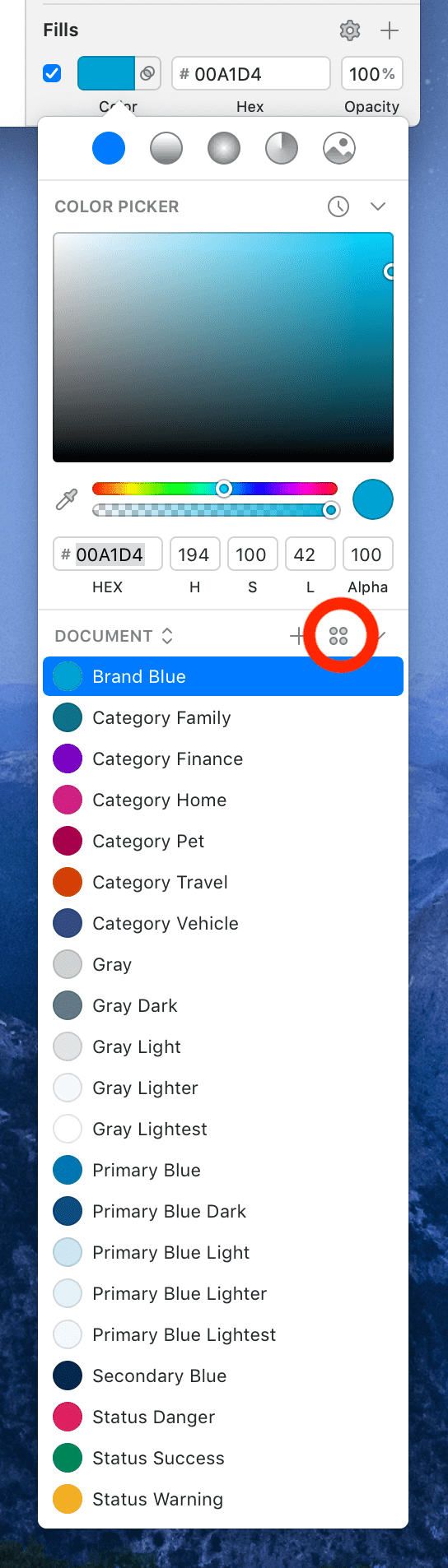
To import Duet’s color palette in Sketch, follow the below steps:
- Download and install Sketch Palettes plugin.
- Download LocalTapiola Color Palette or Turva Color Palette.
- From Sketch’s Plugins menu, select Sketch Palettes / Load Palette… and choose the file you just downloaded.
- Once loaded, you should have the palette visible in Sketch’s color picker. To show the token names as well click the icon with four tiny circles:
List of all available formats #
Below you can find a list of all available formats and paths to them.
- Sass:
"@duetds/tokens/lib/tokens.scss" - Sass Map:
"@duetds/tokens/lib/tokens.map.scss" - CSS Custom Properties:
"@duetds/tokens/lib/tokens.custom-properties.css" - Less:
"@duetds/tokens/lib/tokens.less" - Stylus:
"@duetds/tokens/lib/tokens.styl" - Common.js:
"@duetds/tokens/lib/tokens.common.js" - JSON:
"@duetds/tokens/lib/tokens.json" - Raw JSON:
"@duetds/tokens/lib/tokens.raw.json" - iOS JSON:
"@duetds/tokens/lib/tokens.ios.json" - Android XML:
"@duetds/tokens/lib/tokens.android.xml" - Sketch Palette (Download):
"@duetds/tokens/lib/color.sketchpalette" - Turva Sketch Palette (Download):
"@duetds/tokens/lib/color-turva.sketchpalette"
Testing integration #
To quickly test if Duet Design Tokens are correctly installed, follow the below steps.
- Require common.js module:
const tokens = require("@duetds/tokens") - Use console log to output a list of all tokens:
console.log(tokens) - If everything works, you should now see a long list of Design Tokens in your console.
Keeping tokens up to date #
To make sure you’re using the latest available fonts, run npm outdated to see which packages have updates. If you see outdated versions, use npm update to update to latest minor version. For major versions you have to bump the version numbers by hand in package.json and then run npm install.
Examples #
- The very page you’re looking at is using tokens: Design Token API docs
- For more concrete examples, see templates section in documentation.
Troubleshooting #
If you experience any issues while getting set up with Duet Design Tokens, please head over to the Support page for more guidelines and help.