Modular Grids
Couple months ago while I were designing a website I remembered a technique I had long forgotten. I used to use this technique before I moved from print design to web design about eight years ago and it was, for me, an essential way to utilize modular grids better. Grids in design are kind of like the scales in music. They give you a way to anchor your layout elements and typography to a certain rhythm.
What is a modular grid
A modular grid is a grid which has consistent horizontal divisions from top to bottom in addition to vertical divisions from left to right. Modular grids are created by positioning horizontal guidelines in relation to a baseline grid that governs the whole document. Baseline grids serve to anchor all (or nearly all) layout elements to a common rhythm. [1]
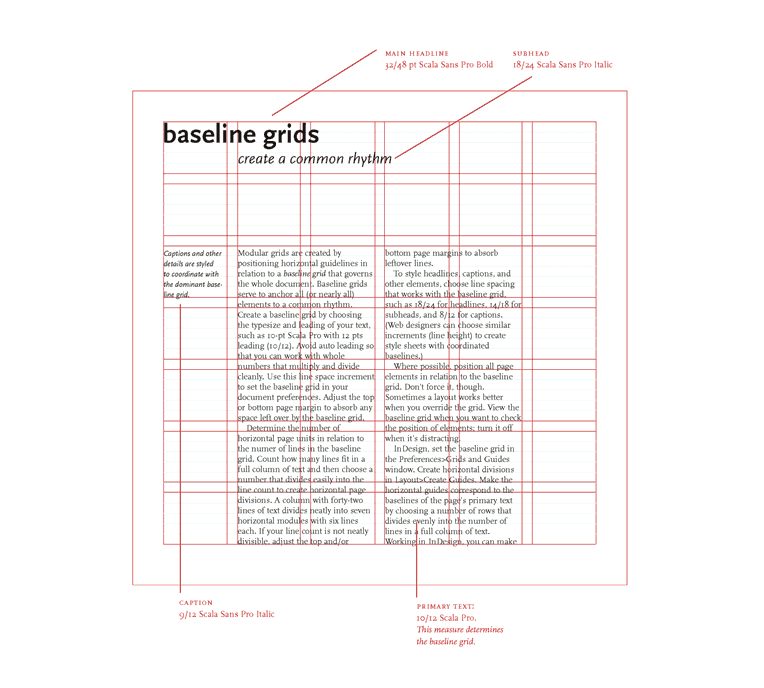
Illustration from the book titled Thinking with type, by Ellen Lupton.
How to use a grid
The thing is, I don’t actually even know the reason why I abandoned this good practice when I moved forward on my career. I might have unwittingly thought that the same practices wouldn’t work in the digital world, but oh boy, I was so wrong back then. This technique is also so bloody simple that I wouldn’t be surprised to hear if most of you are already doing something similar.
My method is this: While you are aligning the design elements to a grid, zoom out the layout (in a browser or a design tool) so much that the size of the layout is around 30-40% of the original and about the size of your phone’s screen in landscape orientation.
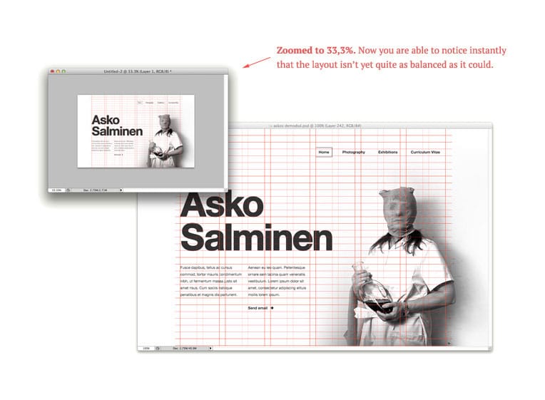
This way it’s much easier to see the balance of the whole layout and if it works visually or not. I also promise that it will make you a much faster (and hopefully better) designer. At least that is how I feel it transformed my own process. Of course, after you’ve zoomed back in to see the layout in its real size, you then have to fine-tune elements and typography and start working on the smaller details.
Remember that not all layouts work the same way though, and because of that, you shouldn’t always force elements to a grid.
Tools to get you started
There is this tool called Modular Grid Pattern which has a Photoshop extension which allows you to create modular grids directly inside Photoshop. Then there’s also this interesting experiment which uses a fluid modular grid framework. There are also a number of tools that allow you to create and use responsive grids, but they are mostly multicolumn grids (with or without baseline grid) and not modular.
Tools are just tools though and the best way to actually start learning is to pick or make a grid yourself and start using it. Check also my resources below, thegridsystem.org for example has a lot of interesting articles and templates if you want to dive deeper.
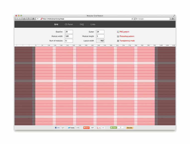
Screenshot from the Modular Grid Pattern app.
Further reading
- Thinking With Type—A Modular Grid [1]
- Designing With Grid-Based Approach
- Making Modular Layout Systems
- The Grid System
- Typography is a grid
- My article about Responsive Typographic Scales
- The Golden Grid System

